Inside Lehigh

Problem
Inside Lehigh is the central location on Lehigh University’s website to communicate institutional strategic messaging and reflect the University’s vision. It provides a convenient way to keep tabs on what's happening on campus including news, events and easy access to the ‘Connect Lehigh’ login portal. Additionally, it includes several relevant key resources for faculty, staff, and current students.
At the time of the project, the page was last redesigned in 2014 and was not fulfilling the purpose to keep students, faculty and staff informed of key university milestones and encourage participation in the campus community through strategic communication.
Solution
After meeting with key stakeholders and conducting research to define user-centered goals and content, we created a page that was reflective of university’s visual identity and fulfilled the overall mission of the page to:
Ensure the campus community knows what is going on - this includes news, events, social media, videos
Provide tools for the campus community to do their job - most sought out resources
Research
Rose, Bud, Thorn Exercise and Affinity Clustering
In order to identify perceived issues and problems, we conducted a Rose, Bud, Thorn exercise with the Communications and Public Affairs team to individually transcribe thoughts of the current page into categories as being positive, negative, or a potential opportunity for Lehigh.
After the exercise was completed, we did affinity clustering to help us to identify focus areas which included:
Utilize current design to make the page easier to digest
Ensure easy access to ‘Connect Lehigh’ Login
Content organization - make the page easier to scan
Market page as something the community knows and wants to come to
Page Analytics and Usage Review
Using Google Analytics and heat maps, we reviewed how the current design was being used and what content on the page was most engaged with. The review include calculating top performance metrics and user acquisition.
This helped identify content priority for the new design.
Competitive Analysis
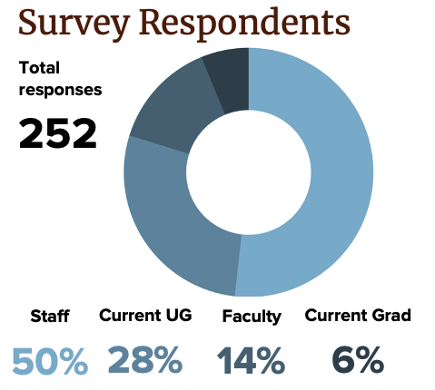
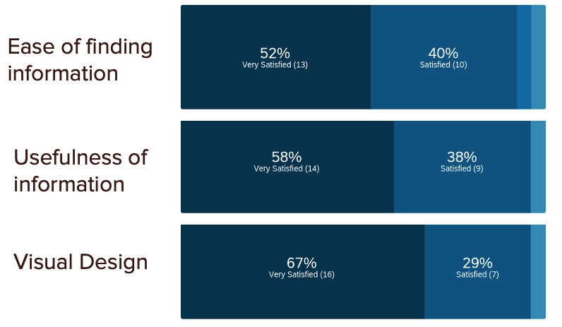
We conducted a user survey to gather feedback from our student, faculty and staff audiences about their level of satisfaction on the current page regarding the ease of finding and clarity of information, and the visual design.
From the survey we found that all audiences mostly came to the page to utilize the ‘Connect Lehigh’ portal login, search the directly or read campus news. We compiled responses to identify areas for improvement such as specific resources were hard to find due to content organization.

We reviewed over 60 schools overall for best practices in content, design and implementation and found that the best implementation balanced communication to campus and resources.
User Survey
Design
Using the information from the research phase, we created a list of areas/content and each’s priority for the page. New areas included a dedicated area for ‘Engaging in the Community’, Instagram and Video and more visual presentation for news communication and events.
Design Iteration
The wireframe creation and high-fidelity mockups went through several rounds of iteration. The final design was tested with student & staff groups and faculty across the university to gather feedback.
Implementation
After the design phase was complete and tested with users, the page was built within the university’s Drupal content management system.
Individual components were created for each section and integrations were developed with outside systems such as the university’s sports news engine and curated Instagram feed.